Brand Identity
✳︎
Graphic Design
✳︎
Creative Direction
✳︎
Brand Identity ✳︎ Graphic Design ✳︎ Creative Direction ✳︎
Role: Brand Designer & Creative StrategistReformr is a conceptual pilates & yoga studio designed to build a strong core and improve movement through structured exercises. I created a full brand system from this brief, from color palette and logos to brand voice and personality.
The opportunity.
To create a pilates brand that leans into the grounded / connected feeling that a yoga studio often has while maintaining a voice that is motivational. The goal was to create a brand that felt human-centered, where every practice feels like a deep breath.
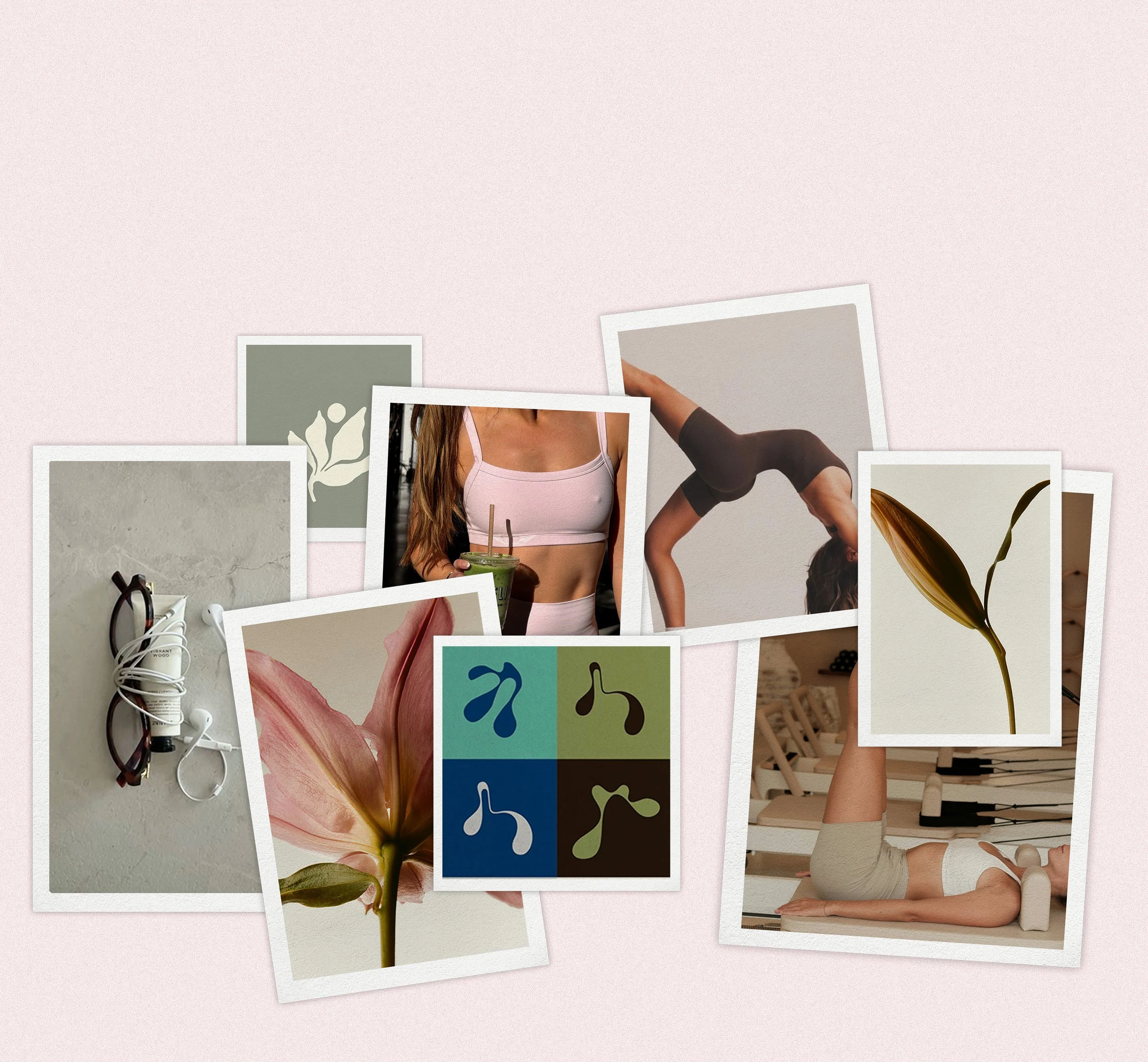
The visual inspiration.
My approach focused on combining earthy wellness with soft femininity to create a visual identity for a customer who equally cares about practical function and aesthetics. Below is the mood board I created to inspire the creative direction for the brand.
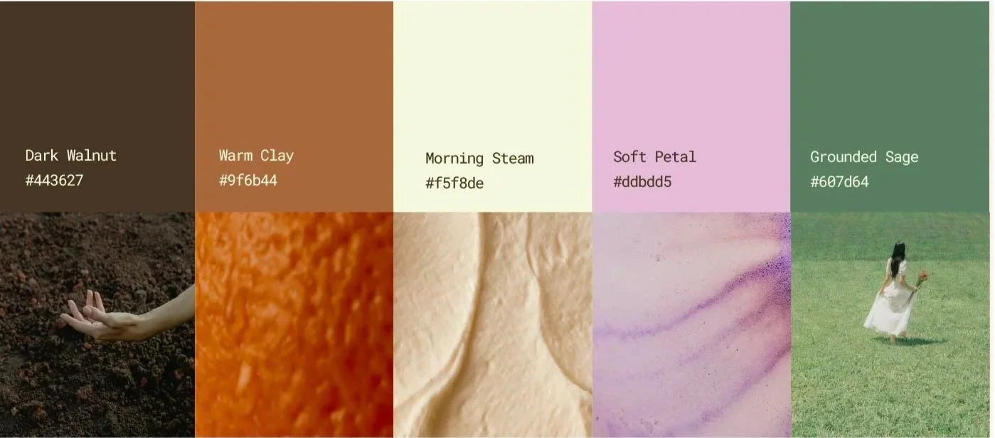
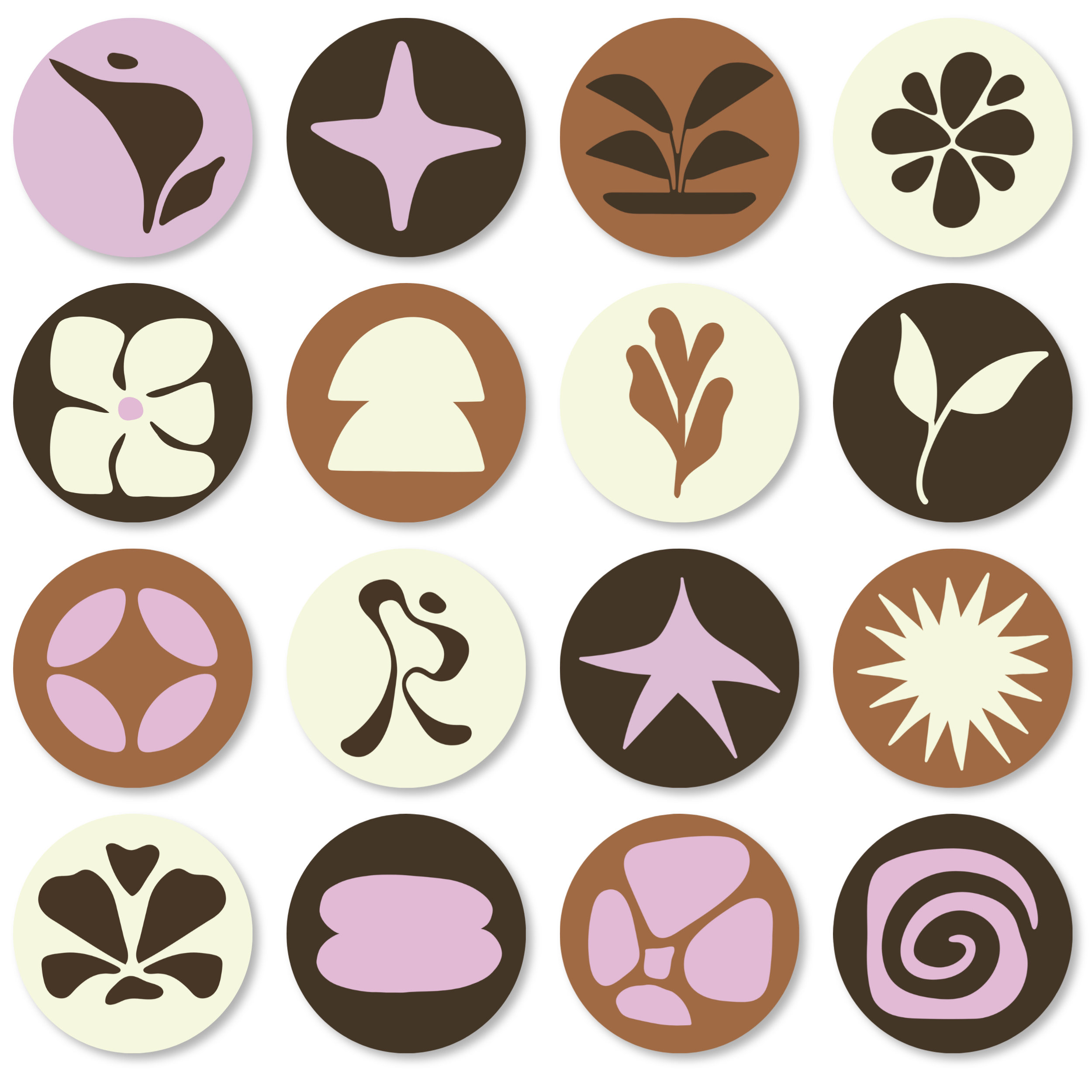
The color palette.
The color palette was thoughtfully chosen to reflect the grounded yet feminine feel that Reformr carries.
I included the hex codes to be used across both web and print.
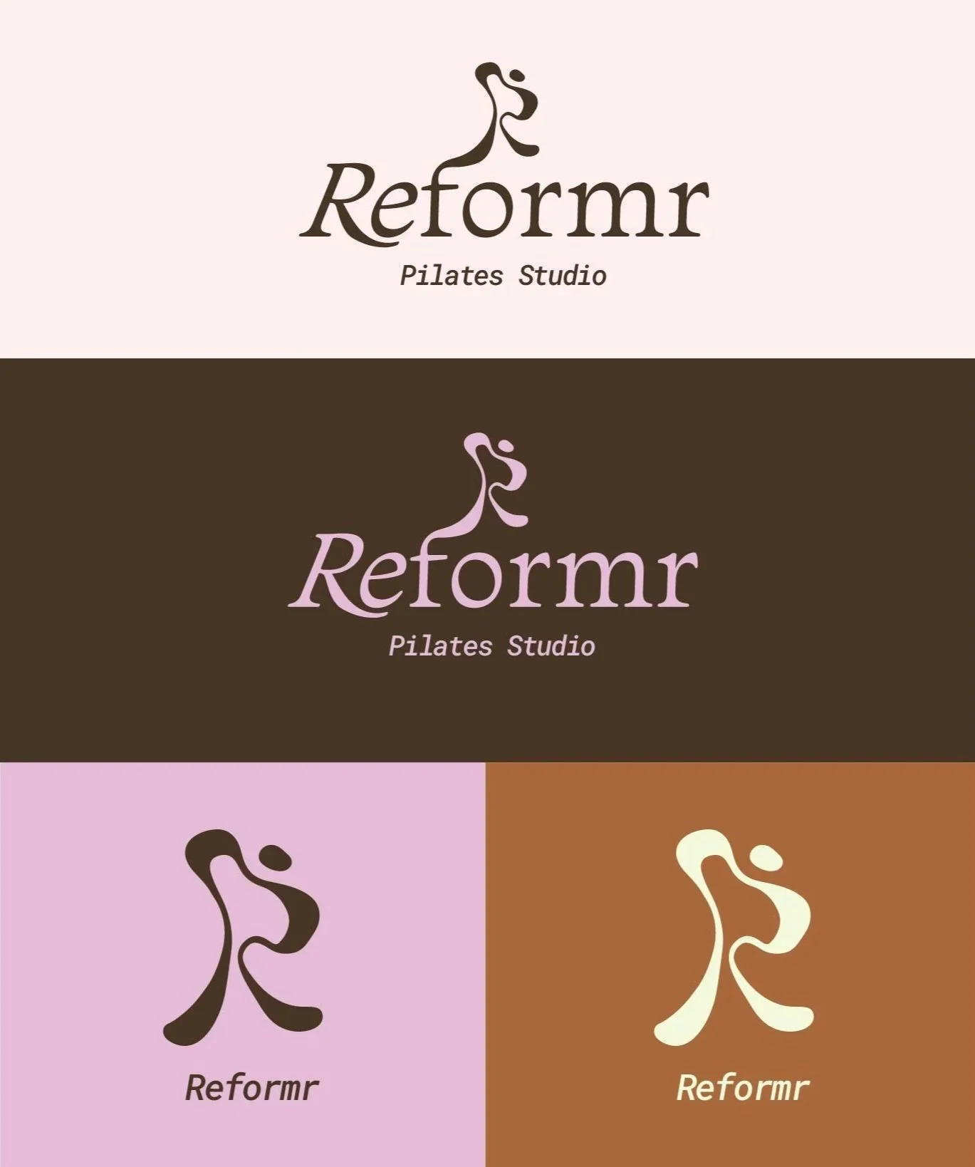
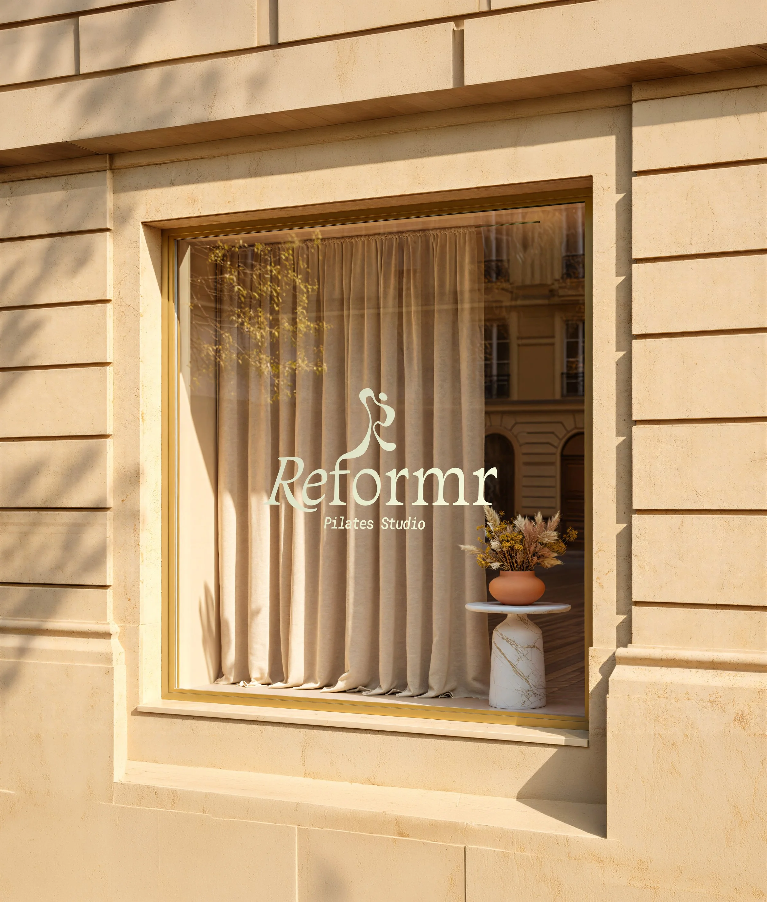
Logo variations.
The inspiration behind the logo came from wanting to mimic organic shapes and lines to represent the flow of movement during classes. The logo is meant to represent both the letter R and the general shape of a person. I lean towards imagery that is abstract rather than literal. The choice to have the icon extending from the F came from wanting to continue a sense of fluidity within the design.
The result was both a primary logo and icon that can be used in a variety of cases, shown in light and dark scenarios to exhibit the versatility of the design.
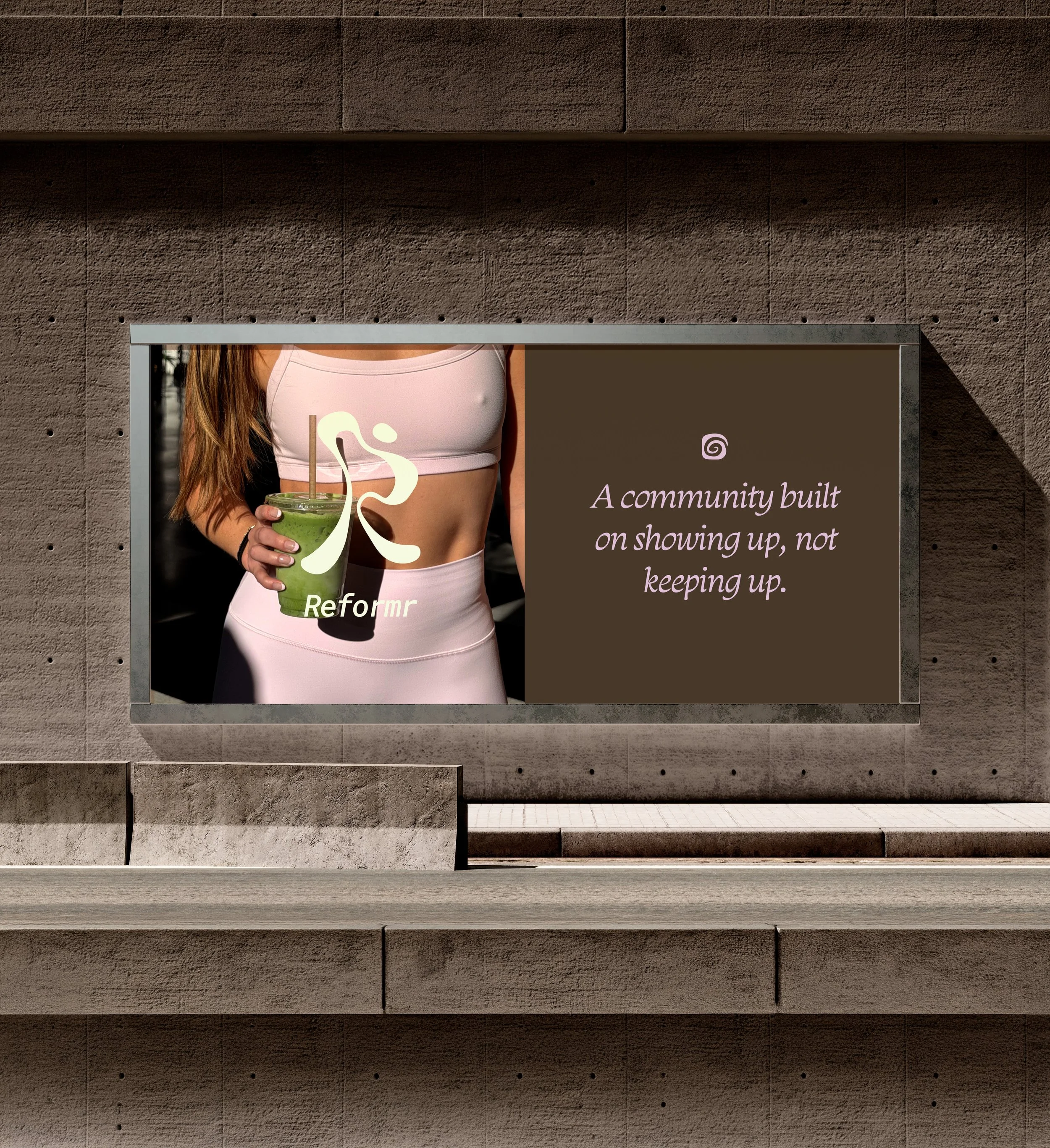
Real world application.
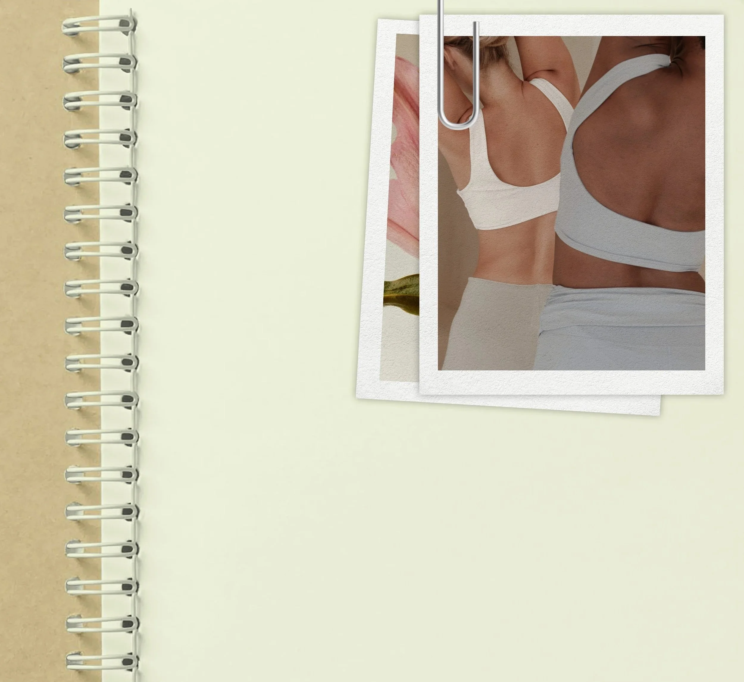
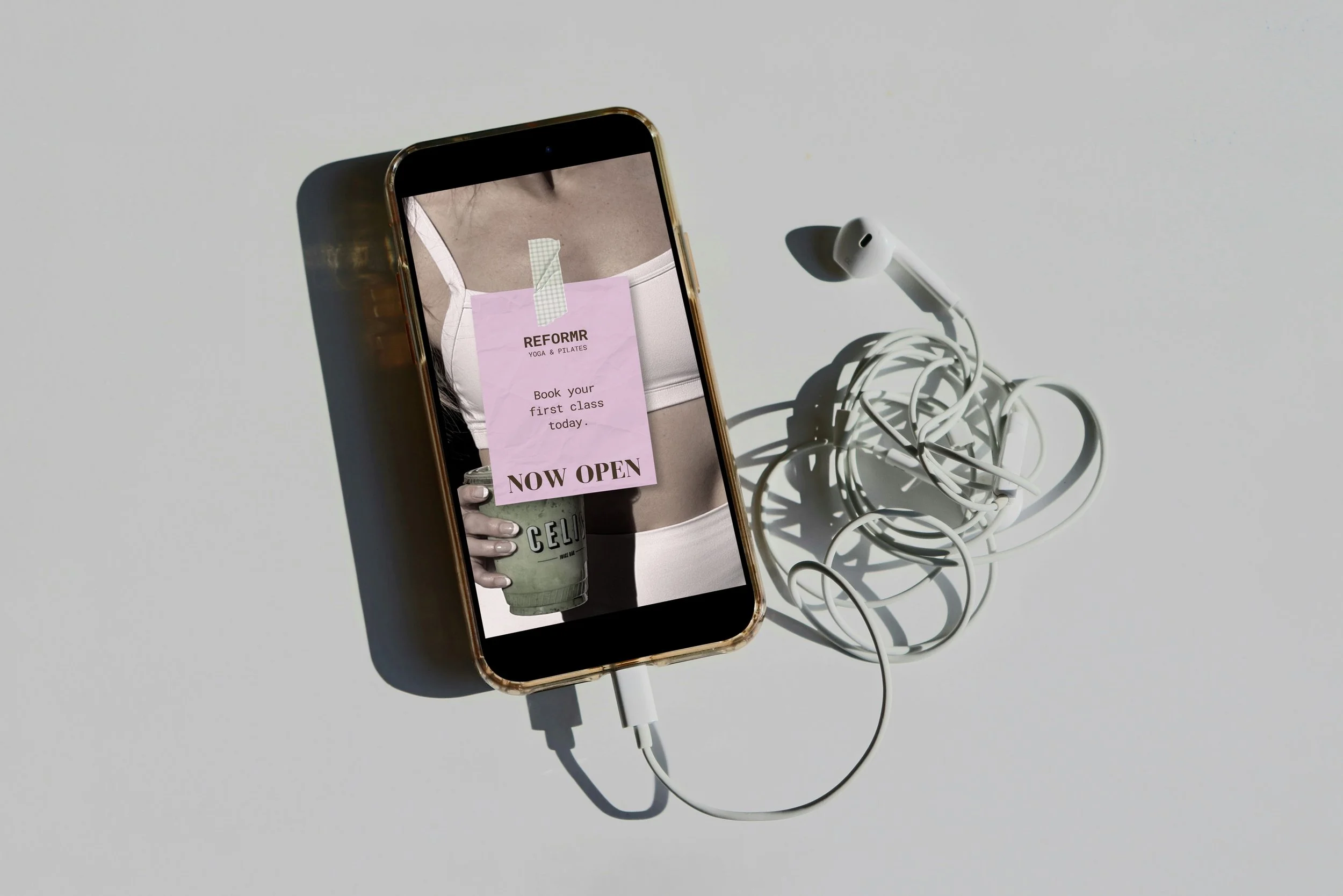
Instagram highlight covers

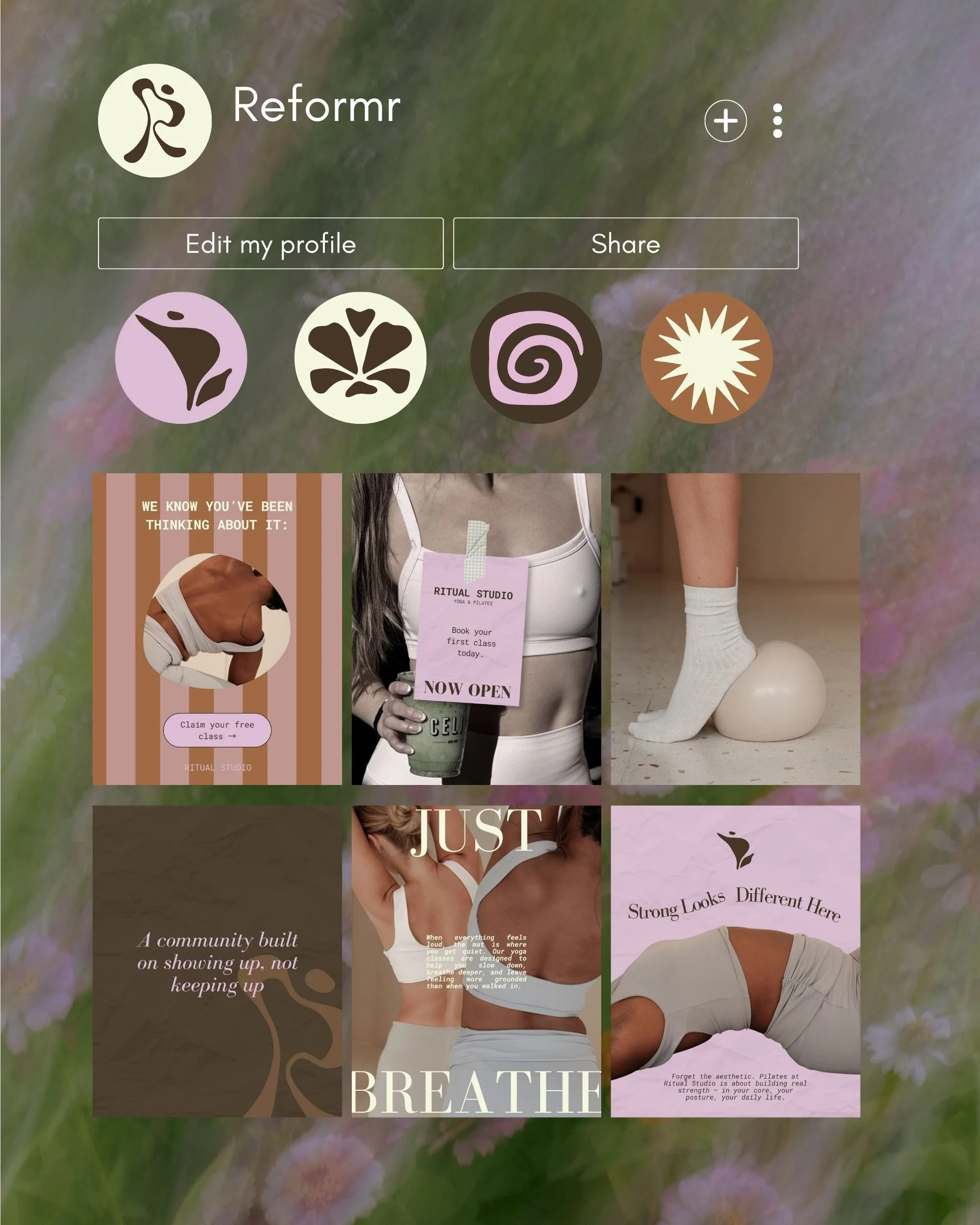
Sample social media grid
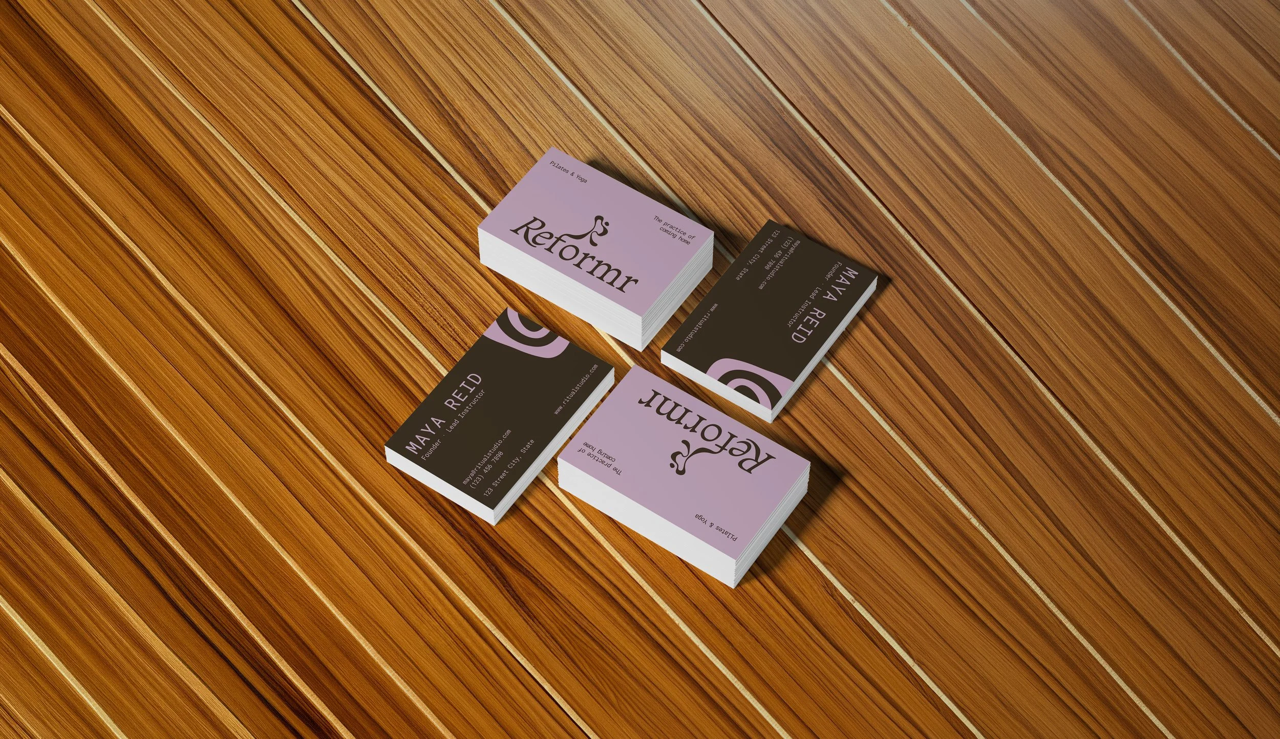
Business card mockup
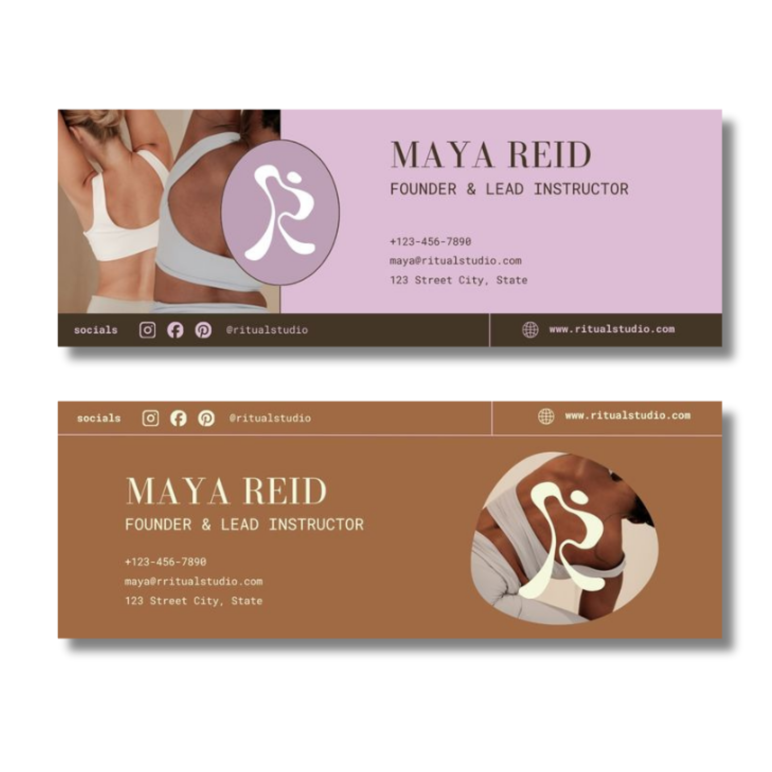
Email signature
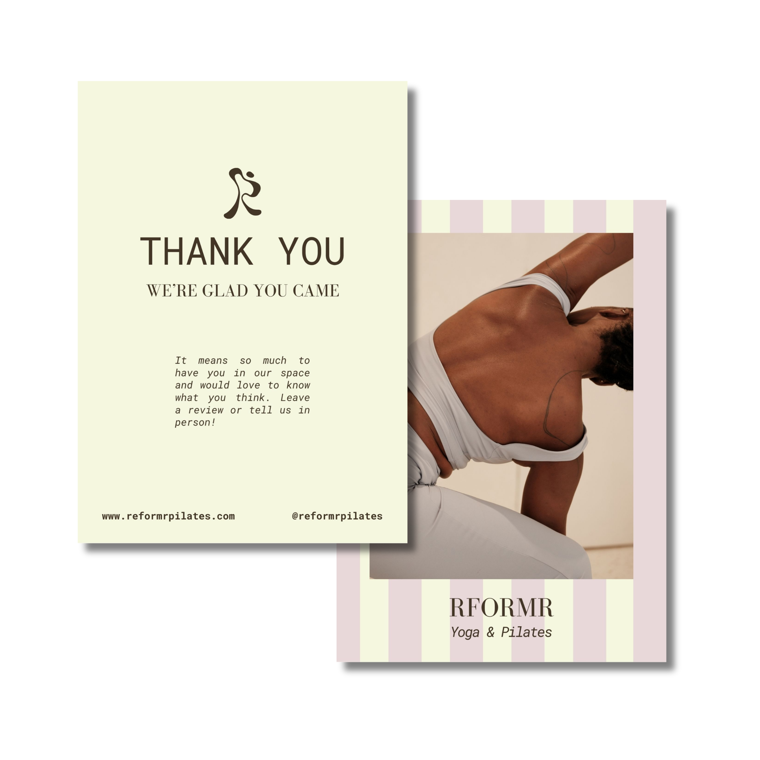
Thank you card
Key Takeaway.
This project honed my abilities to take a simple brief and transform it into an entire brand identity. It resulted in a full logo suite, color palette, social media assets, and more. The branded materials and mockups look like they can live in the same visual world as one another, achieving the goal of creating a cohesive look. I look forward to taking what I’ve learned from this project and applying it to real world scenarios, from idea to execution.